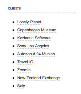
While redesigning this blog (I love being able to edit css and template as easily as blog posts, go github pages!), I found myself turning this:
 Ordered chronologically
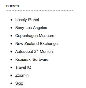
Into this:
 Ordered by aesthetic
I find the wave a lot more pleasing to the eye, and I still kept the primary order mostly intact. This is one of my design tenets - lay out the page by weight and balance, then work out what text you can fit into each of the boxes.
It’s almost the opposite of how the signals do design, but I love it.

 atom feed
 github
 twitter