Choropleths are those heatmap style maps you often see. I’ve been keen to render some heatmaps out of the twitterplaces data I have, so I spent today learning R and using it to generate some graphs.
First up - I installed R using the os x binaries, then went right on to install rgdal.
Installing rgdal on snow leopard
To load map data, you first need to install the PROJ and GDAL frameworks. Then you need to install the R bindings for GDAL. When you try and install RGDAL from source - you may get this error:
Error: gdal-config not found
The gdal-config script distributed with GDAL could not be found.
To let R know where gdal and proj are - try this:
install.packages("rgdal", configure.args = " \
  --with-gdal-config=/Library/Frameworks/GDAL.framework/unix/bin/gdal-config \
  --with-proj-include=/Library/Frameworks/PROJ.framework/unix/include \
  --with-proj-lib=/Library/Frameworks/PROJ.framework/unix/lib \
",type="source")
R packages install super fast for me, rgdal took about 30 seconds to build and install. I’m beginning to see why people like this package.
Plotting california state boundies
Download the california shape files from the US census, then load the data and plot it:
cali=readOGR("/tmp","co06_d00")
plot(cali)
You should get a graph of californian country boundaries:
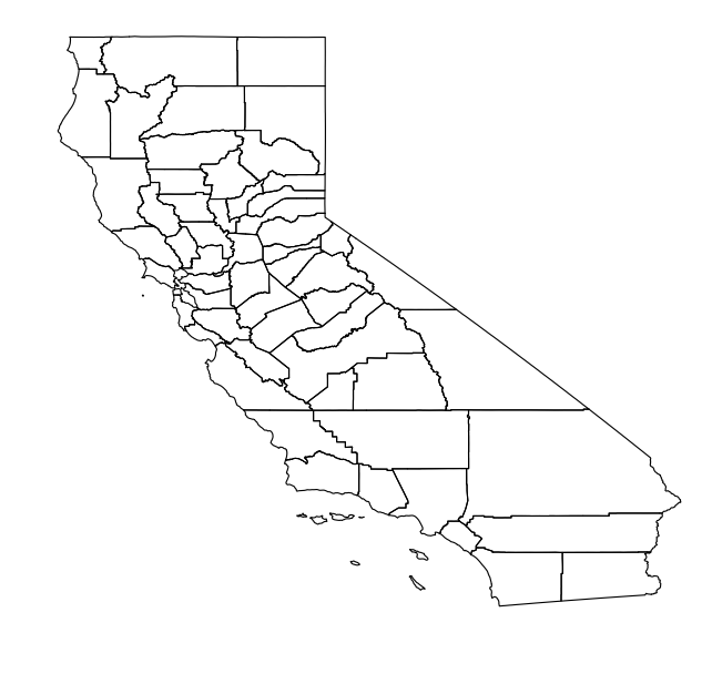 Plot of US census geo data
Now to extract data from my twitter data.
Generating neighbourhood shapefiles
As I import tweets from the twitter firehose, I create records in my place table that store the geometry data in a postgis polygon field. This means I can use pgsql2shp to extract the geometry data and create shape files that can be loaded into arcgis explorer, or imported into R using the readOGR command.
To generate my shape file - I run something like:
pgsql2shp -f london -u postgres tp_dev "select \
  name, geom \
from \
  places \
where \
  kind='neighborhood' and city_id=( \
    select id from cities where name='London' \
  )"
Which gives me 115 rows, all of the neighbourhoods in London that I have crawled so far. Plotting this data in R:
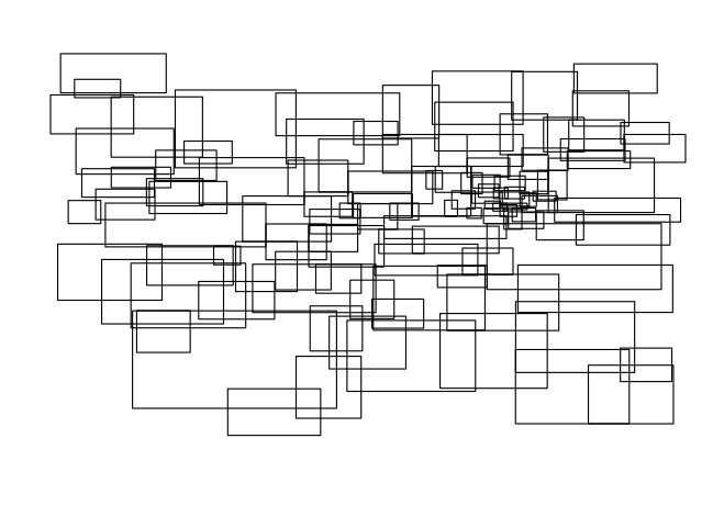 Plot of London twitter neighbourhoods
Twitter uses third party data to geocode your tweets. Sadly, the neighbourhood data isn’t free, so twitter can only share bounding boxes, which is why the map is all boxes.
In the future I might try querying openstreetmap for boundary data of administration areas 9 and 10, but I’m not sure how complete that data is.
Getting Tweet frequency
I re-ran the neighbourhood shape file dump, to include the number of users tweeting from each neighbourhood in london. The query ended up looking something like this:
select \
  id, geom, name, ( \
    select count(distinct user_id) from tweets where place_id=places.id \
  ) as user_count \
from \
  places \
where \
  city_id=( \
    select id from cities where name='London' \
  ) AND kind = 'neighborhood' \
order by \
  user_count desc;
I can then load this data into R, create a blue palette and plot it in 3 lines:
pal <- brewer.pal(9,"Blues")
plot(lon,col=pal[9 - (lon$USER_COUNT * 9 / max(lon$USER_COUNT))],border="white")
The graph however - is kinda disappointing, since the overlapping bounding boxes - combined with some very large neighbourhood areas, makes the graph pretty much useless.
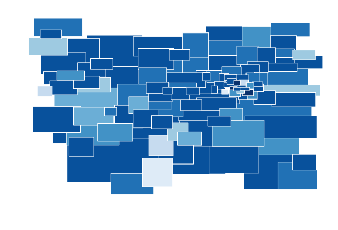 Darker blue represents more tweets
Two dimensional histogram
After failing at my first graphing experiment, I tried plotting a two dimensional histogram of tweets. First up - spit out all the lats and longs of tweets from postgres. I haven’t installed the r<->postgres bindings yet, so I have to export to CSV and then import to R.
Enable CSV export from psql.
\f ','
\a
\pset footer off
\o /tmp/tweets.csv
Then query…
select
  st_x(geom) as x, st_y(geom) as y, extract(hour from created_at) as hour
from
  tweets
where
  geom is not null
and
  st_x(geom) < -100
This also gives us the hour of the day that the tweet was made, which might come in handy later. I loaded this data into R, then I could plot a scatter graph:
tweets <- read.csv("/tmp/tweets.csv")
plot(tweets$x, tweets$y)
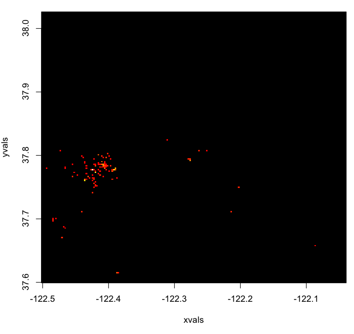
Gives a random looking graph with a concentration of points around the mission.
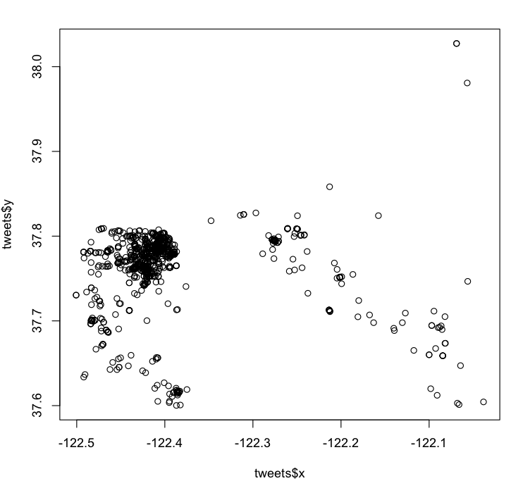 A scattergraph of 1600 geotagged tweets around San Francisco
Okay - what does this look like as a 2d histogram?
hist2d(tweets$x,tweets$y)
 A 2d histogram of tweets around San Francisco
Starting to get interesting - but still way too sparse. Let’s trim the area down to only include San Francisco proper, from the Marina District in the north, to the mission in the south.
city <- subset(tweets, y < 37.808 & y > 37.750 & x < -122.370 & x > -122.457)
Then let’s plot it in perspective 3d
h <- hist2d(city$x, city$y, nbins=25)
persp(
  h$x,
  h$y,
  h$counts,
  ticktype="detailed",
  theta=30,
  phi=30,
  expand=0.5,
  shade=0.5,
  col="cyan",
  ltheta=-30
)
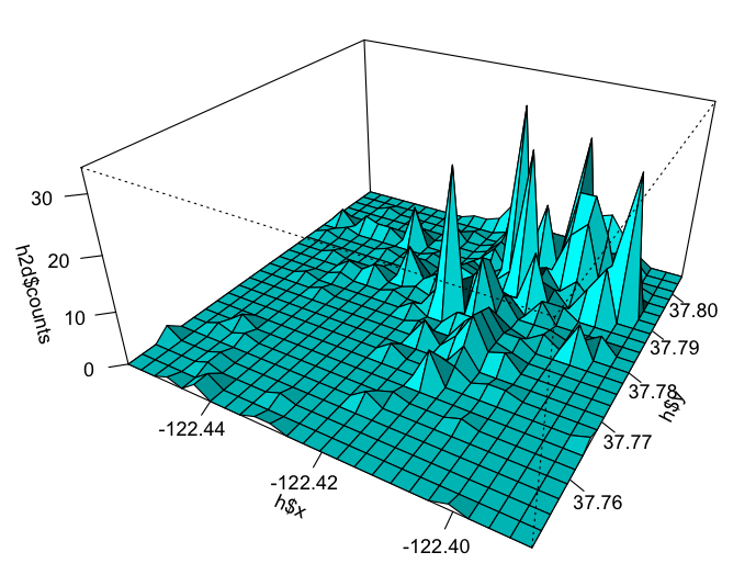 User count in San Francisco rendered in a perspective view
The mission / cbd is in the top right of this graph, so you can see where most people are during the day.
Animating the graph over time
This is rendering 5 hours of data on one graph, but I was interested to see how the activity looked on an hourly basis, so I wrote a little R script to re-render the graph for each hour of the day, which may be a topic for tomorrows blog post.
nb: Note that I never actually created realistic looking choropleths in this post. ;D

 atom feed
 github
 twitter