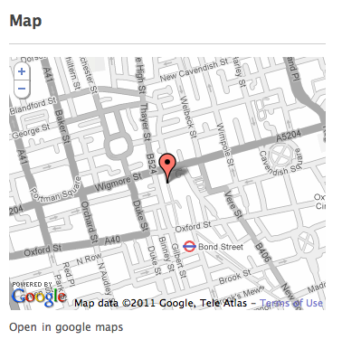
You’re building your site, you do it nice, you have regular line spacing, lots of white space, even gaps, nicely kerned typography. You took your triplet css values #ccc to #c3c3c3 for that perfect shade of grey, changed all the borders from dotted to solid. Your website is maybe starting to look like the pages of a design magazine. Then you add google maps to the page.
It’s like smearing playdough on your furniture.
Try using google styled maps and desaturate the map to get something that looks more like this. Still functional, but easier on the eye and suitable to my bauhaus sensibilities.
 Desaturated, label opacity reduced

 atom feed
 github
 twitter