I’ve been designing a new mapping interface for a product I’m releasing shortly. I’ve copied the design of the twitter app for ipad, which has multiple sliding panes. I was trying to work out the widths of each pane so that the app looked a bit more cohesive, when I decided to try out the golden ratio.
I’m using stylus - which is an excellent css toolkit, similar to sass or less.
golden-ratio = 1.61803399
base-width = 48px
The base-width is the width of the skinniest column on the left side of the page. I then use multiples of the golden-ratio and the base-width to chose the widths of the other columns.
.modes-presenter
  width base-width

.places-list-pane
  width (golden-ratio ** 4 * base-width) - 40px

.place-show-presenter
  width (golden-ratio ** 4 * base-width) - 40px
I’m not sure if it was a placebo effect - but the end result was quite pleasing to me.
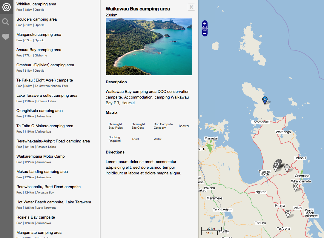 Early prototype with GR-sized columns

 I may be available to work on Javascript and Rails projects,
 atom feed
 github
 twitter